Our video plainly represents Nova as being a confident, not sexualised woman who is independent in herself.
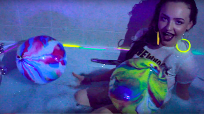
Whilst other music videos represent women as having to dress revealingly in order to gain confidence, our music video represents women's confidence as exuding from being expressive in themselves. This representation of females is shown throughout the music video. This is shown by Nova always being covered up with clothes, even in the bathtub shots, Nova is wearing a T shirt, making her not sexualised.
Nova is a representation of a young adult/ teenage female. Her representation is to be confident and true to your self. This is expressed through Nova's personality within the video. Nova is never shy, her actions and movements are always large and unapologetic. She makes eye contact with the camera throughout which shows the confidence which she has.
Showing posts with label research. Show all posts
Showing posts with label research. Show all posts
Tuesday, 19 December 2017

Group Reflection
Reflection media from katiedunning17
This is a PowerPoint made to express our group reflection for our group of four.
This is a PowerPoint made to express our group reflection for our group of four.
Friday, 15 December 2017
Shortlisting Album Cover Photos
When deciding on a photo to choose for the album cover, we had to consider what photo would capture the essence of both the music video and the genre/style of the artist herself. Before we decided on the final photograph, we picked a few photos that we thought could make a good cover and representation of her music. However we ended up choosing a photograph of Nova with purple lighting in the background, with the same multi-coloured lights wrapped around her that were used in the video, sitting on the floor. The photos below show a few of the different looks that Nova is flaunting in the video, however we did not think that they were strong enough to be the album cover.
Shortlisted Photos:


Photo used for album cover:

Photoshoot Inspiration
I came across this photo on social media of a pop star called 'Solange' of a photoshoot for 'Glamour Magazine'. When I saw this, it made me think of the type of image I see Nova as, and aspires to be like aesthetically and it inspired some of the glittery outfits and fluorescent lights used throughout.


Song Name Development
When developing the ideas of the song names, we had to keep in mind that Nova is slightly abstract and unconventional, which reflects in the other cross media conventions and should do in the album too. With the help if this website: http://blog.sonicbids.com/8-strategies-for-naming-a-song-with-no-obvious-title , researching the song names of other artists of a similar genre and our own creativity, we were able to think of appropriate names to form a cohesive album which is relevant to Nova. We also took some inspiration from film names such as 'neon demon', as the title reflects Nova's weird but wonderful style which carries hues of darkness and deep song lyrics.
Nova Interview
Above is the video of Nova's interview of which we have uploaded to YouTube. This interview is based from Noah Cyrus's MTV interview, exhibited through the replication of the style from that video. The interviewer asks simple get-to-know-me style questions which is useful to Nova, as she is a new artist who people are unaware of.
Tour Poster Draft 2

This is another tour poster we designed for Nova. This poster shows our colour theme which is purple, the main background image was a photograph taken of a sparkly pink bottle which was used as a prop, it also featured in our photo shoot. The design is a simple layout with Nova's name and album name in big bold font which is easy to read and eye-catching. We used the same font for all texts as it shows clear links to our other media products such as the website. One improvement we could make to the tour poster would be to make the size and colour of the texts more obvious to be see as it can be quite difficult to read the text. We also incorporated an image of Nova onto the poster so she can be recognised instantly by her fans, this image can also be seen in the music video which helps to create synergy.
Tour Dates Poster

We designed a simple poster for Nova with the aim that it would be effective and eye-catching. We used the same font throughout the poster which can also be seen throughout our other media products. The difficulty we faced when designing the poster was that the background picture is dark in quality so it can be hard to clearly see the white writing.
When creating the poster we did take in ideas and concepts from our inspiration posters such as Ellie Goulding's tour poster:


We took inspiration from the layout of the tour dates especially how the month and year was in bold we then used a similar template using the date above the venue.
Tour Dates Inspiration


The above two images show tour dates poster for Ellie Goulding and Little Mix.
Ellie Goulding is the main image of the tour poster creating the star image and a recognisable image for her fans and viewers of the poster. Her name is featured at the top of the poster in a large easy to read font. The template is simple and clearly states the dates and venues of her tour which makes it easy for an audience easy to interpret. The theme of the poster is focused on her but also portrays a colour theme of pink/purple which shows synergy across her media products.
For Nova's tour poster, we will incorporate some of the concepts Ellie Goulding has used such as using an image of Nova as the background and making sure the size and font of the text is clear to read.
Little Mix has also used a simple layout for their tour date poster. The use of bright bold colours such as the blue, pink and yellow are eye-catching and help draw attention to the poster. The name 'Little Mix' is also bold and recognisable to an audience. The list of tour dates and venues is well represented and portrayed. At the bottom of the poster it also features the day and time the tickets will be coming on sale which is very useful and helpful to those wanting to purchase tickets.
Digipak album Poster

This is our Digipack album poster which will be used to advertise Nova's album "Nobody Better". It will be used in music stores such as HMV to attract customers who are already looking to purchase music related products.
The design of the poster is quite simple using the main image of Nova to create the 'star image'. We have used the colour theme of purple which helps to create synergy across our media products. We have also used the same font text which is used on our website, digipak and magazine cover to create parallels between the products and create a recognisable image for Nova. Following our inspiration from Rihanna's poster we decided to also include the actual image of our album cover and include the names of two singles featuring on the album, in order to create excitement around the new album as fans may have already heard Nova's single and are intrigued to hear more.


Here you can see the poster we designed for Nova's album and our inspiration from Rihanna's album poster. Its clear to see that we used a similar layout as we felt the template was clear to interpret, we also liked how Rihanna had incorporated her red theme and decided to do the same using our purple theme helping to create synergy with our media products.
Digipak Poster Inspiration


Here are two styles of album advertisements in the form of posters. Both artists are single female performers the same as Nova. The artists themselves are the main focus of the posters and all attention is therefore drawn to them.
Rihanna - The main theme of the poster consists of the colour red which helps to tie both the images together. The layout is very simple with a main picture of Rihanna and then the actual image of the alum cover in the bottom right this is a way of advertising the album by showing her audience and potential customers what the album looks like. The font and text is easy and clear to read and includes the name of two of her singles featuring in the album which helps to create 'hype' around the album and appeal to her audience who may have already heard the songs.
Lana Del Ray- The poster for her album 'Born To Die' is a simple yet effective layout. The main picture of Lana is eye catching and bold which will appeal to her existing fans encouraging them to purchase the album. The colour theme also fits together with blue sky background linking to the blue text.
Overall both poster advertising their albums consist of a simple layout with little text which makes it effective to a consumer who needs to be attracted instantly into buying the product without having to read to much. Having the main images of the artists reinforces the 'star image' which appeals to fans.
Mark scheme and music video comparison
Mark scheme and music video comparison
This is the mark scheme for level 4 which is the top band within the mark scheme. As a group we felt that it was important throughout the process of creating our music video to constantly look back at the top band mark scheme in order to secure the best marks and achieve a high grade.
Here is the mark scheme for level 4....
Level 4 Criteria 32-40 marks
Level 4
The candidate is expected to demonstrate excellence in the creative use of most of the following technical skills:
shooting material appropriate to the task set; including controlled use of the camera, attention to framing, variety of shot sizes and close attention to mise en scene
editing so that meaning is apparent to the viewer and making selective and appropriate use of shot transitions, captions and other effects
recording and editing sound with images appropriately
Where a candidate has worked in a group, an excellent contribution to construction is evident.
So how does how video fit into the top band?
Our music video is creative and unique. Our filming footage is of excellent quality including a range of angles and shots to create help portray the theme of our music which is 'wonky funk'. We have consistent mise en scene throughout the video through the use of specific props such as fairy lights and balloons. These props have also been used on all other forms of media products such as our digi - pack creating synergy amongst our media products.
The use of editing in our music video fits well with the song, the first half of the song consists of quick beats therefore all our cuts and transitions fit in time to the music making the video fit in time to the pace of the song. The last part of the song slows down and heavily contrasts to the first half therefore we have picked up on this and used editing to show the contrast. The cuts were slowed down and shots were shown for longer, we also used colour correction to add colour to certain shots to highlight how the song as changed and in addition so had the artist. Other editing techniques used include reverse and mirroring.
This is the mark scheme for level 4 which is the top band within the mark scheme. As a group we felt that it was important throughout the process of creating our music video to constantly look back at the top band mark scheme in order to secure the best marks and achieve a high grade.
Here is the mark scheme for level 4....
Level 4 Criteria 32-40 marks
Level 4
The candidate is expected to demonstrate excellence in the creative use of most of the following technical skills:
shooting material appropriate to the task set; including controlled use of the camera, attention to framing, variety of shot sizes and close attention to mise en scene
editing so that meaning is apparent to the viewer and making selective and appropriate use of shot transitions, captions and other effects
recording and editing sound with images appropriately
Where a candidate has worked in a group, an excellent contribution to construction is evident.
So how does how video fit into the top band?
Our music video is creative and unique. Our filming footage is of excellent quality including a range of angles and shots to create help portray the theme of our music which is 'wonky funk'. We have consistent mise en scene throughout the video through the use of specific props such as fairy lights and balloons. These props have also been used on all other forms of media products such as our digi - pack creating synergy amongst our media products.
The use of editing in our music video fits well with the song, the first half of the song consists of quick beats therefore all our cuts and transitions fit in time to the music making the video fit in time to the pace of the song. The last part of the song slows down and heavily contrasts to the first half therefore we have picked up on this and used editing to show the contrast. The cuts were slowed down and shots were shown for longer, we also used colour correction to add colour to certain shots to highlight how the song as changed and in addition so had the artist. Other editing techniques used include reverse and mirroring.
Thursday, 14 December 2017
Location analysis
In our video, we wanted the emphasis to be solely on Nova, as it was a performance video. We wanted the locations to be minimalistic and simple, in order to remain the audience's focus on Nova herself, and not the backgrounds and locations.
Our five locations were:


Our five locations were:
- outdoor in front of foliage

- Bathtub


- Indoor conservatory on sofa

- Outdoor in residential street

- In front of fairy lights

As you can see in these screenshots, Nova is the main emphasis of each as they all have plain backgrounds, which make her and her outfits stand out considerably.
Editing Techniques
Before we begun the editing process for our music video for Nova, we all established that we wanted the final product to be very slick with fast paced cuts and a use of different effects throughout.
In order to learn this, the person in charge of editing (Anneka) had to research and learn the techniques for this desired outcome. Anneka watched YouTube tutorials for her preferred learning style.
Above is a video which Anneka learned some effects to implement into the music video. From this YouTube video, Anneka used the mirror/ reflection effect (mirror), and the colour hue change (colour balance HLS). The mirror effect was used variously throughout the video, and colour balance HLS was used within the latter part of the video.
Secondly, an effect which was used majorly throughout the video was Warp Stabiliser. As within the filming process we did not use a tri-pod and it was mainly hand held filming, some shots were inevitably shakier than we had preferred. Anneka researched into methods of smoothing out the shaky footage, then learned how to use warp stabiliser. This effect is used on almost all of our shots in the music video.
However, it was then discovered that once warp stabiliser had been added onto a clip, you could not change the speed. Anneka research found that if 'nest' was added onto the clips, it allowed the videos speed to be changed also.
Another major effect which was used in the music video was the use of zooming in and out on clips desirably. This was particularly predominant within the latter section of the video, of which the outdoor dancing shots are quickly zoomed in and out on the beat of the music. Anneka used this video to learn this editing trick, of which she successfully applied to the video.
In order to learn this, the person in charge of editing (Anneka) had to research and learn the techniques for this desired outcome. Anneka watched YouTube tutorials for her preferred learning style.
Above is a video which Anneka learned some effects to implement into the music video. From this YouTube video, Anneka used the mirror/ reflection effect (mirror), and the colour hue change (colour balance HLS). The mirror effect was used variously throughout the video, and colour balance HLS was used within the latter part of the video.
Secondly, an effect which was used majorly throughout the video was Warp Stabiliser. As within the filming process we did not use a tri-pod and it was mainly hand held filming, some shots were inevitably shakier than we had preferred. Anneka researched into methods of smoothing out the shaky footage, then learned how to use warp stabiliser. This effect is used on almost all of our shots in the music video.
However, it was then discovered that once warp stabiliser had been added onto a clip, you could not change the speed. Anneka research found that if 'nest' was added onto the clips, it allowed the videos speed to be changed also.
Another major effect which was used in the music video was the use of zooming in and out on clips desirably. This was particularly predominant within the latter section of the video, of which the outdoor dancing shots are quickly zoomed in and out on the beat of the music. Anneka used this video to learn this editing trick, of which she successfully applied to the video.
Wednesday, 13 December 2017
Music Video inspiration
This music video by Katy Perry for her hit song California Gurls was one which as a group, we agreed was of inspiration for our music video for Nova.
The music video collectively is similar to ours for Nobody Better by Nova due to the colour scheme used, which is predominantly purples, with dream-like imagery.
Additionally likewise to Nova's, there are a lot of shots which are alike, such as wide shots of the protagonist laying down, tracking shots of her walking forwards and backwards, and numerous shots of the scenery and surrounding objects in order to break the narrative. The video also shows a lot of Katy Perry lip syncing the song, making it more of a performance video, like Nova's.
Friday, 8 December 2017
Digipak feedback
Digi pack feedback from katiedunning17
This is our Digi pack feedback. This presentation shows the positives and improvement feedback we received and the improvements we made as a result of this.
This is our Digi pack feedback. This presentation shows the positives and improvement feedback we received and the improvements we made as a result of this.
Interview Research

Interviews are a key way to unveil an artists personality which allows fans to feel connected to the artist. It will also help to attract our target audience. In this presentation we looked at two interviews for MTV one particular interview we looked at was Noah Cyrus, we chose this artist as she is also a young female artist, like Nova, who is quite new to the industry so we felt it would be useful to see her interview. Her style on interview was heavily edited with lots of animations, her songs were also played in the background we thought this was a good idea and would try to incorporate it in to our interview.
Subscribe to:
Posts (Atom)

-
Vernallis's theory is based upon music editing. The theory has four main concepts which consist of: narrative editing camera movemen...
-
3 song pitch from Anneka Williamson Here is our group's slideshow of our three top song choices for the final music video Wh...
-
 This is an evaluation of our footage and photographs taken from our first day of shooting. Overall we felt that the first day of filming we...